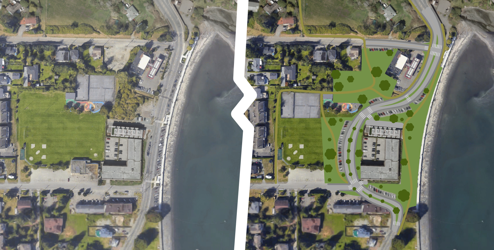
Thinking about public space while sitting at Departure Bay Beach, I came up with this concept. This is just a concept, there may be issues that I haven’t considered, I just did it for fun.
One rather significant issue in this concept is the increased space taken by the road (compared to the existing layout), 😖 which is not something I’m supportive of.
A few of the noteworthy changes in this concept…
- The most significant change in this concept is the road alignment. Making Departure Bay Rd curve around the west side of the centremost building – rather than along the shoreline, east of the building. This shifts some of the eastern-most space from the sports park to the waterside park. Maximizing public space on the waterfront while still leaving lots of space in the sports park for the ballfield and more.
- Secondly the reworked streetscape could allow for a more pedestrian friendly space as well as better integration with the adjacent commercial properties (and the sports field and waterpark). The curves of the road, inclusion of multiple raised crosswalks, compact parking design, and narrow lanes could encourage slowing of automobile traffic making for a safer streetscape.
- Also presented in this concept is an attempt at unifying and opening the public spaces. Opening up the borders of the sports park so it is accessible from the eastern edge (along the road), as well as unifying the existing parkland with the parkland north of the waterpark and tennis courts. The tennis courts themselves are moved to allow for the road alignment and to make the public areas more continuous.
Again, this is just a quick concept I did for fun, exploring ideas of what could be done with the spaces we have available.

It’s worth noting that the building my re-imagined road tramples on (near the bottom of the image) does not actually exist anymore – and in-fact that parcel of land is currently empty and for sale. It seems the necessary land for this concept is currently unused (or already city owned).


